Bunzo's
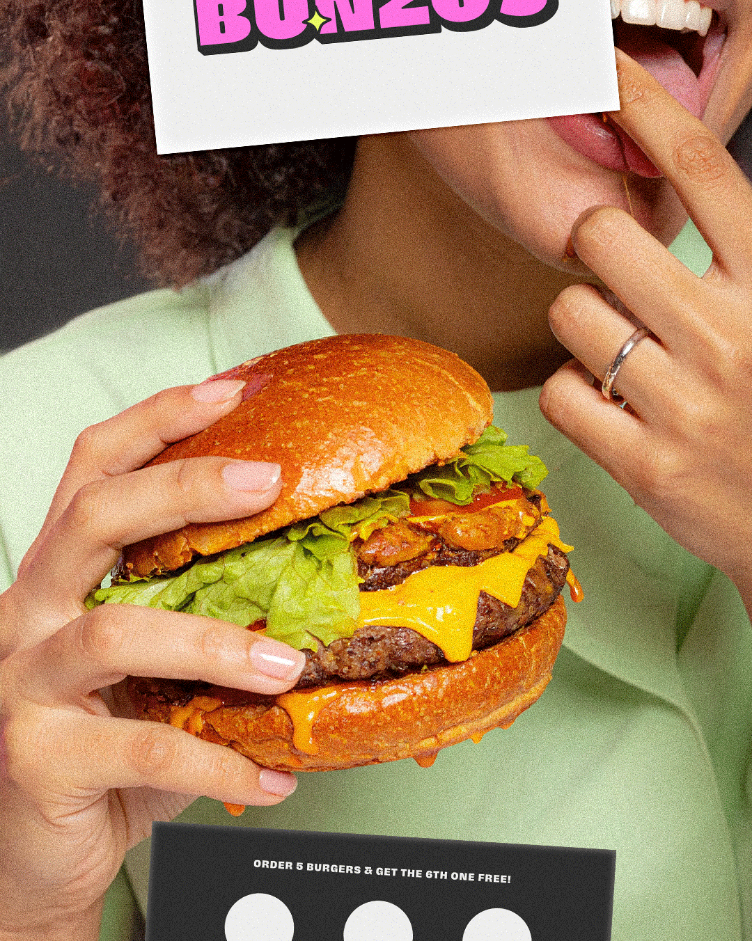
Welcome to Bunzo’s, the American burger joint that’s landed straight from Nevada. Known for serving the juiciest burgers that earthlings can’t get enough of, Bunzo’s has one secret weapon: their signature alien sauce. One bite, and you’ll swear you’ve been teleported to another planet.
Rumour has it, Bunzo’s first opened near the mysterious lands of Area 51 back in the 1980s, where humans and aliens gathered under neon lights for a taste of something extraordinary. Today, it’s more than just a restaurant... It’s a place where worlds collide, flavours unite, and diversity is always on the menu.
Now sit back, relax, and get ready to explore the world (and beyond) of Bunzo’s branding.
Services:
Brand Identity, Strategic Design, Packaging Design, Illustration Design
The Design Approach:
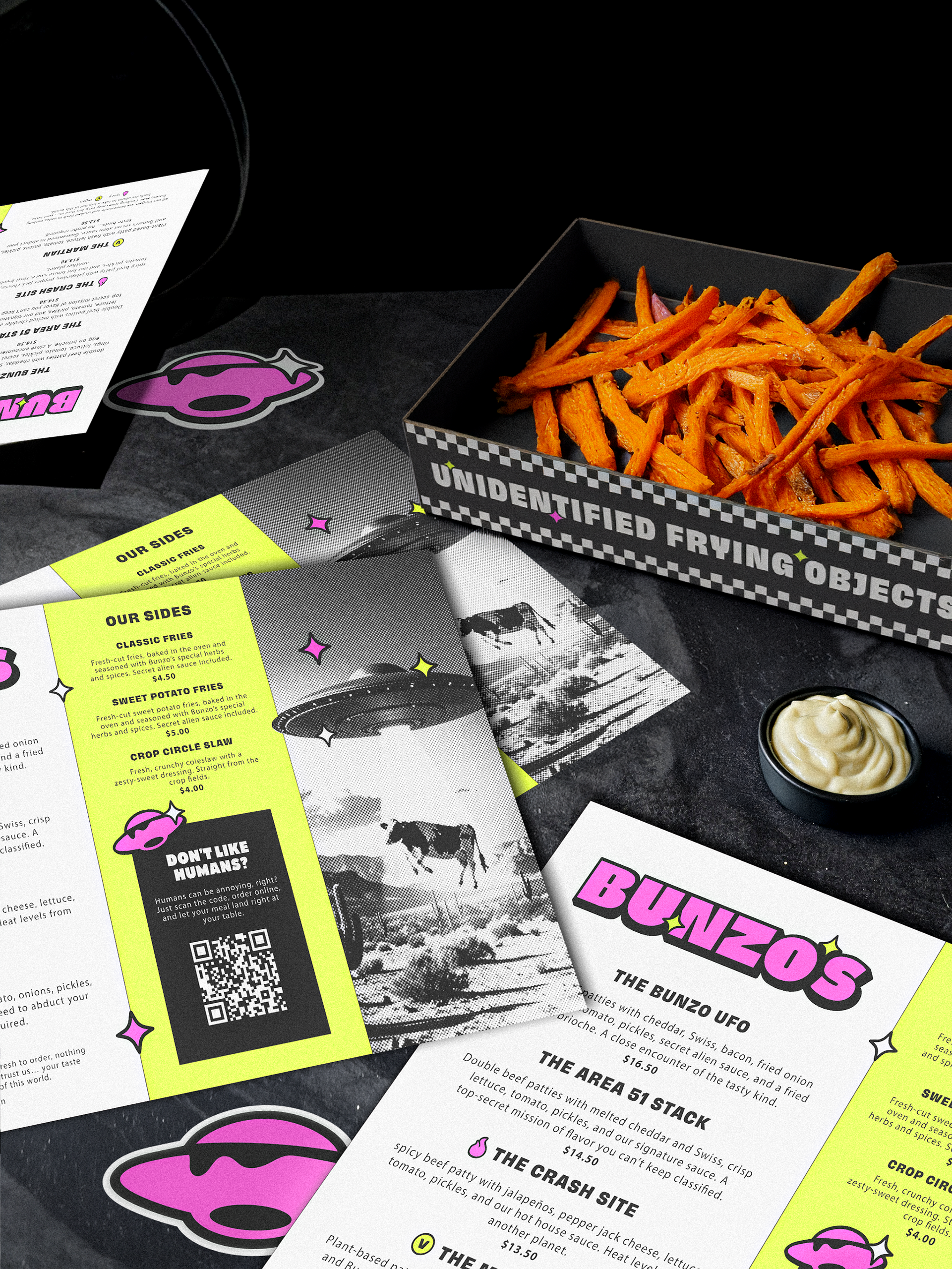
The visual identity was developed around the narrative of Area 51, incorporating alien-inspired elements such as UFOs, stars, and intergalactic motifs to create a distinctive and memorable aesthetic. This concept was chosen to differentiate Bunzo’s from competitors through strong storytelling and a playful sense of mystery.
The branding, packaging, and pattern design were crafted to appeal to a broad audience, with a focus on sparking curiosity and delivering a unique visual experience that aligns with the brand’s imaginative character.
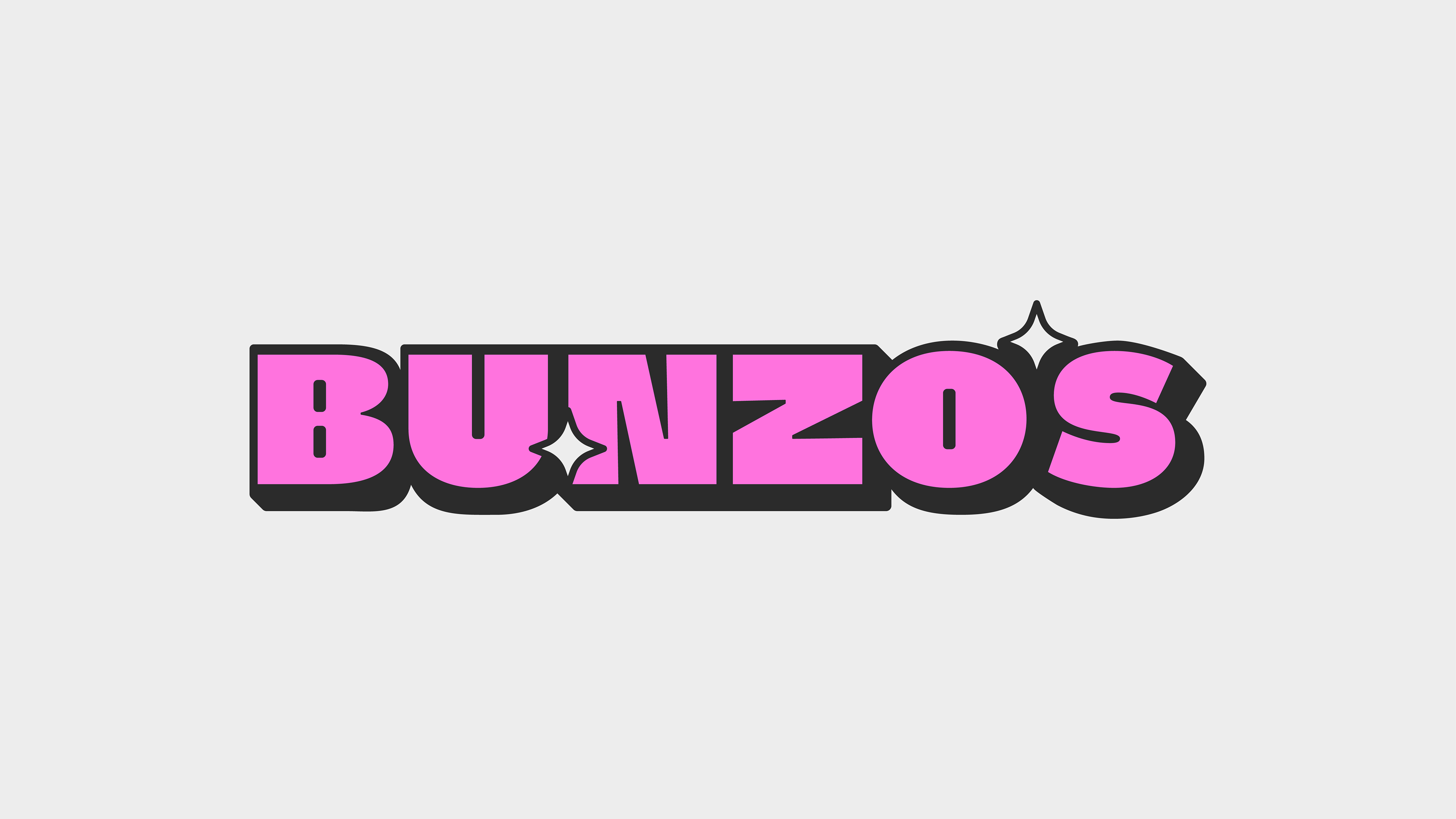
The Logo:
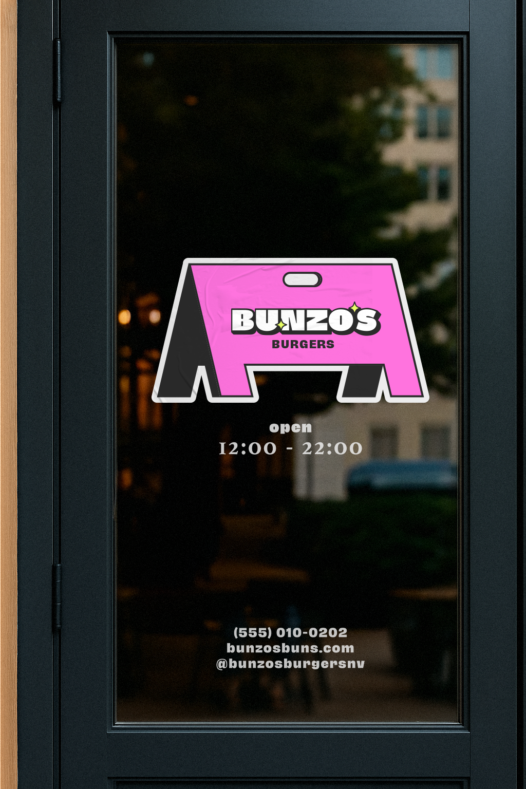
The Bunzo's logo was custom designed to establish a distinctive and memorable identity for the brand. A subtle border frames the logo, adding a retro touch reminiscent of classic diner signage, while the bold typography keeps it feeling fresh and contemporary.
Two stars were incorporated to enhance depth and reinforce the brand’s celestial theme, one of which cleverly replaces the apostrophe, adding a playful twist that ties back to the overall concept. The clean composition ensures clear readability while subtly hinting at the brand’s intergalactic narrative.
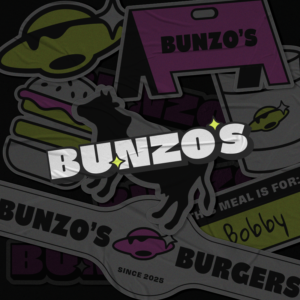
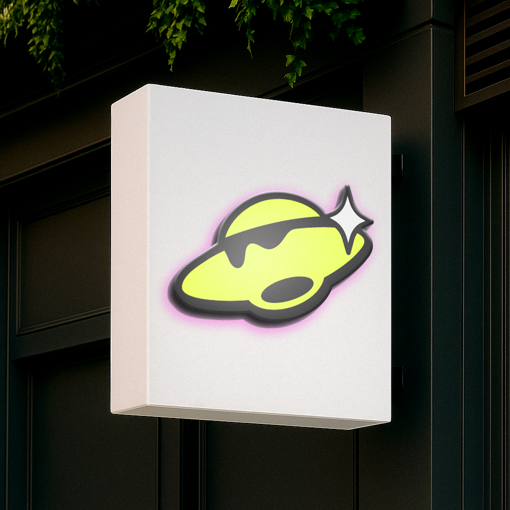
The Brand Icon | Lettermark:
The Bunzo's icon was designed to represent a UFO, reimagined to align with the brand’s playful food theme. To tie the concept together, the UFO was stylised to resemble melted cheese dripping from its surface which creates a fun and memorable connection to the brand’s burger identity. A star element, consistent with the main logo, was also incorporated to maintain visual harmony across all brand assets.
Additionally, a lettermark variation was developed to offer flexibility for various applications, such as social media and smaller-scale branding materials.


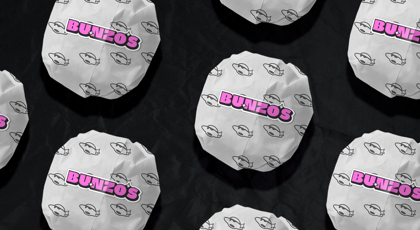
The Packaging:
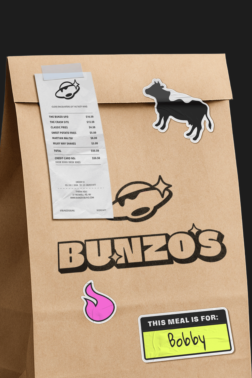
The food packaging design focused on enhancing the overall eating experience through playful, functional stickers. These stickers not only help seal packaging (like burger wrappers and takeaway bags) but also make orders easily recognisable. For example, a “This meal is for…” label adds a personal touch, while icons like a flame indicate a spicy burger.
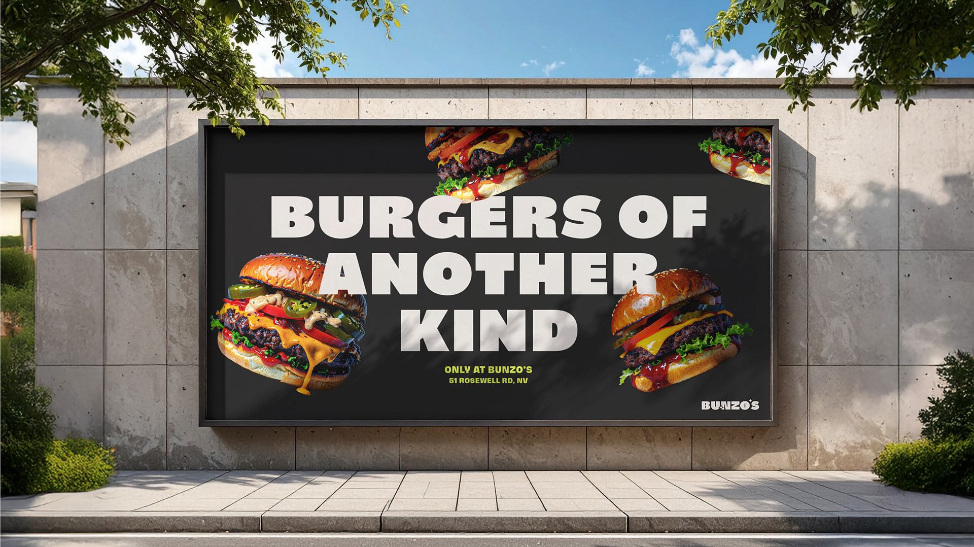
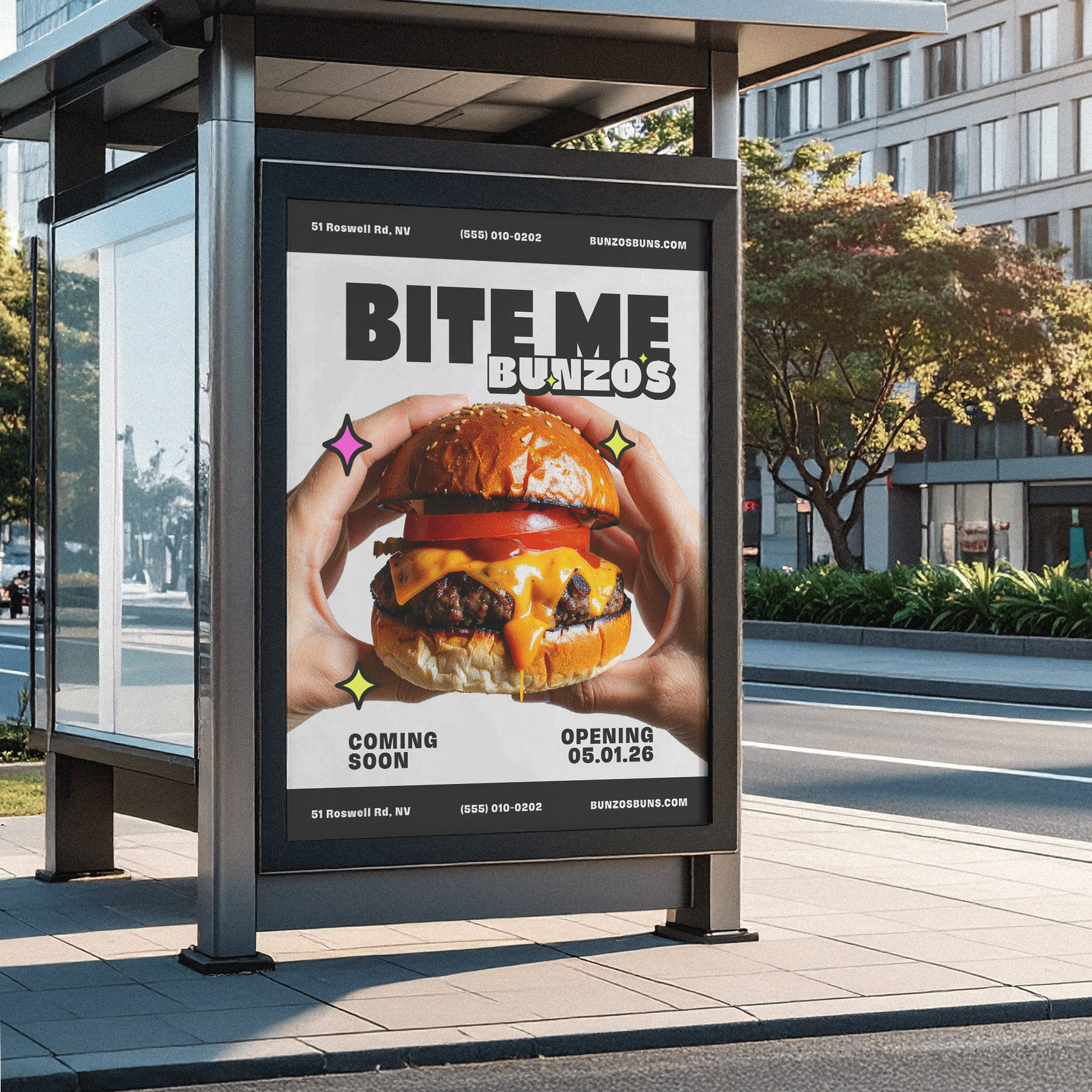
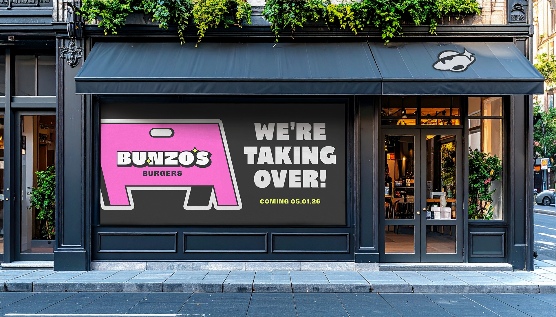
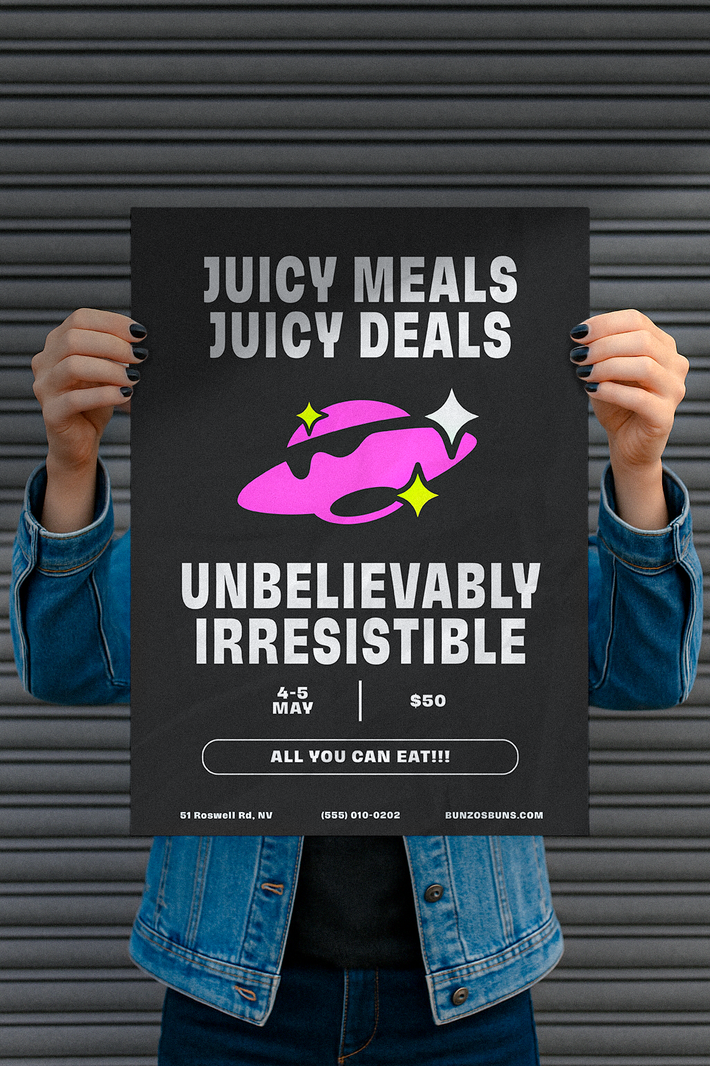
Print & Promo
All print and promotional materials were designed intentionally to capture the brand’s playful character while sparking curiosity among its audience. Phrases like “We’re taking over” and “Unbelievable” were strategically used to strengthen brand personality and encourage engagement, creating a more dynamic connection between Bunzo’s and its customers.

Behind The Design:
I am so proud and grateful that I got to design for Bunzo's and it definitely will be a project that I will think about for a long time.
My goal for this project wasn’t to create a typical burger joint brand or focus solely on the restaurant. Instead, I wanted to use human curiosity to invite people to try Bunzo’s. Not just as a place to eat, but as a place to create an experience and make memories for themselves.
This project reminded me of the power of storytelling, not just to promote a product, but to spark imagination and connection. As with all my work, my focus for Bunzo’s was clear: to communicate, engage, and bring value both to the brand and its audience.
Bunzo's, it was a pleasure :)