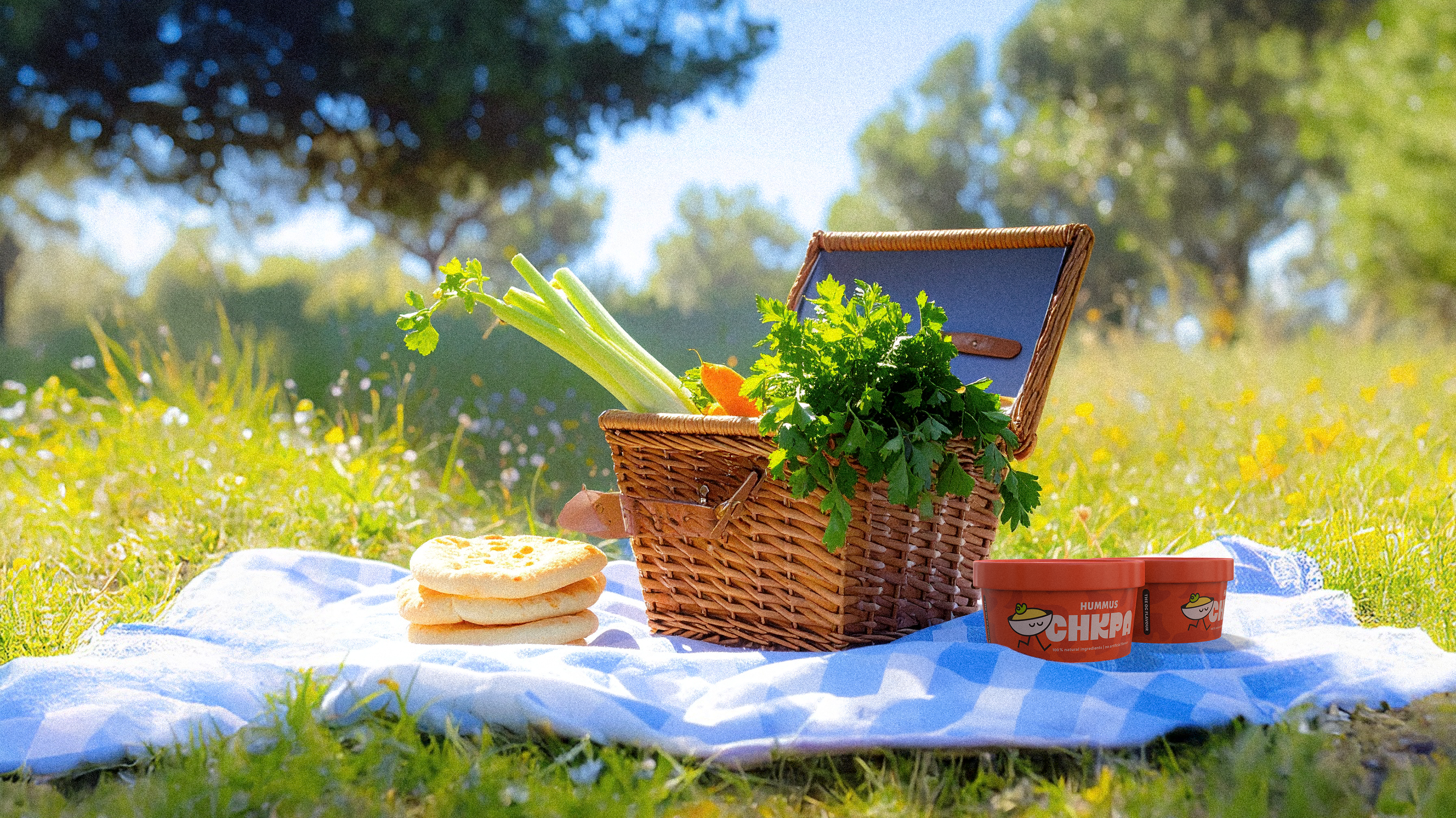
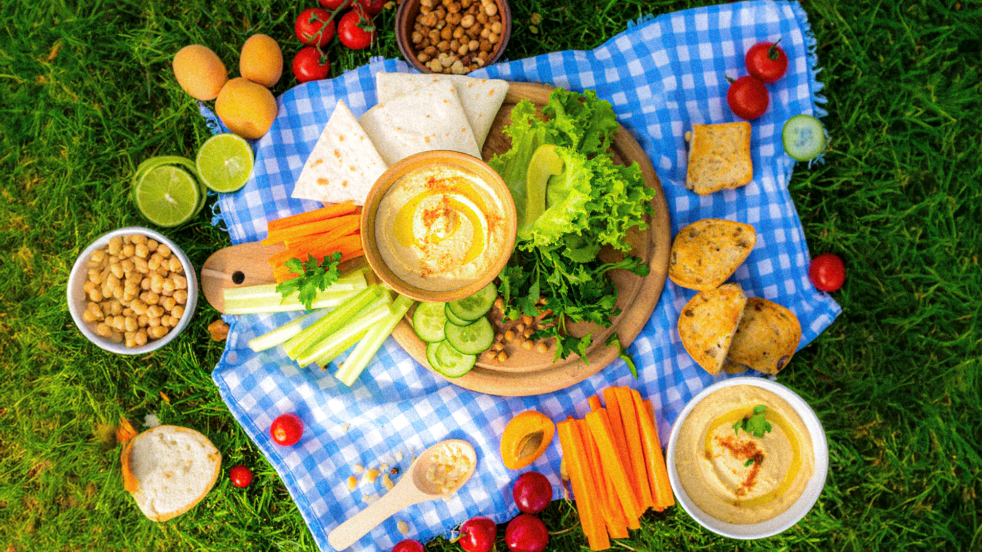
Chkpa is a Mediterranean-inspired hummus brand inspired by its flavour, simplicity, and connection. Made exclusively with natural ingredients, free from artificial flavourings and added sugars, Chkpa brings an authentic taste experience straight to the table, whether it’s at home, at a picnic, or during an outdoor barbecue. Designed for easy portability and everyday moments, Chkpa is more than a dip. It is made for shared experiences, spontaneous gatherings, and the occasional playful debate over who gets the last scoop.
Services:
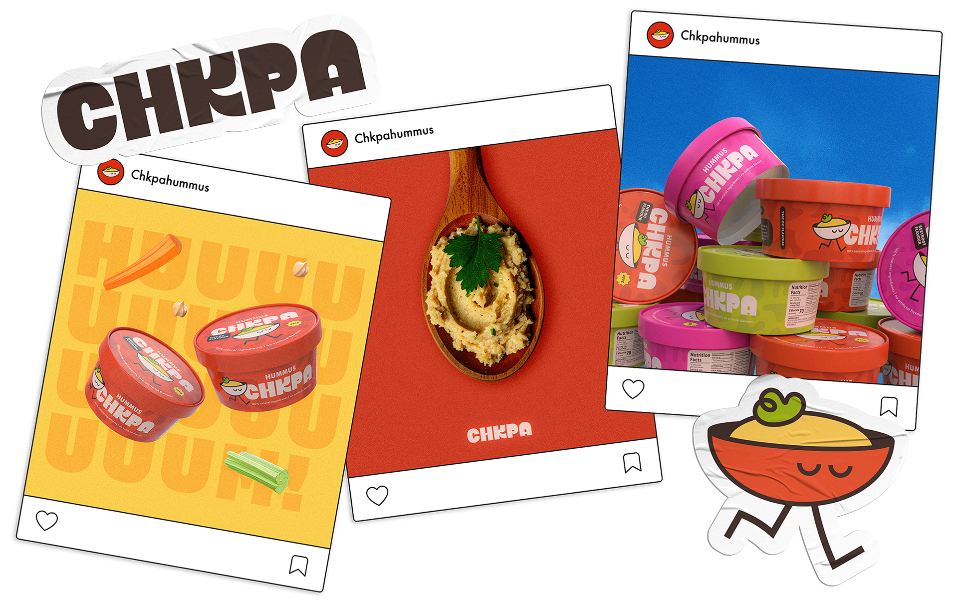
Brand Identity, Social Media Content Creation, Strategic Design, Packaging Design, Mascot Design, 3D Design
The Design Approach:
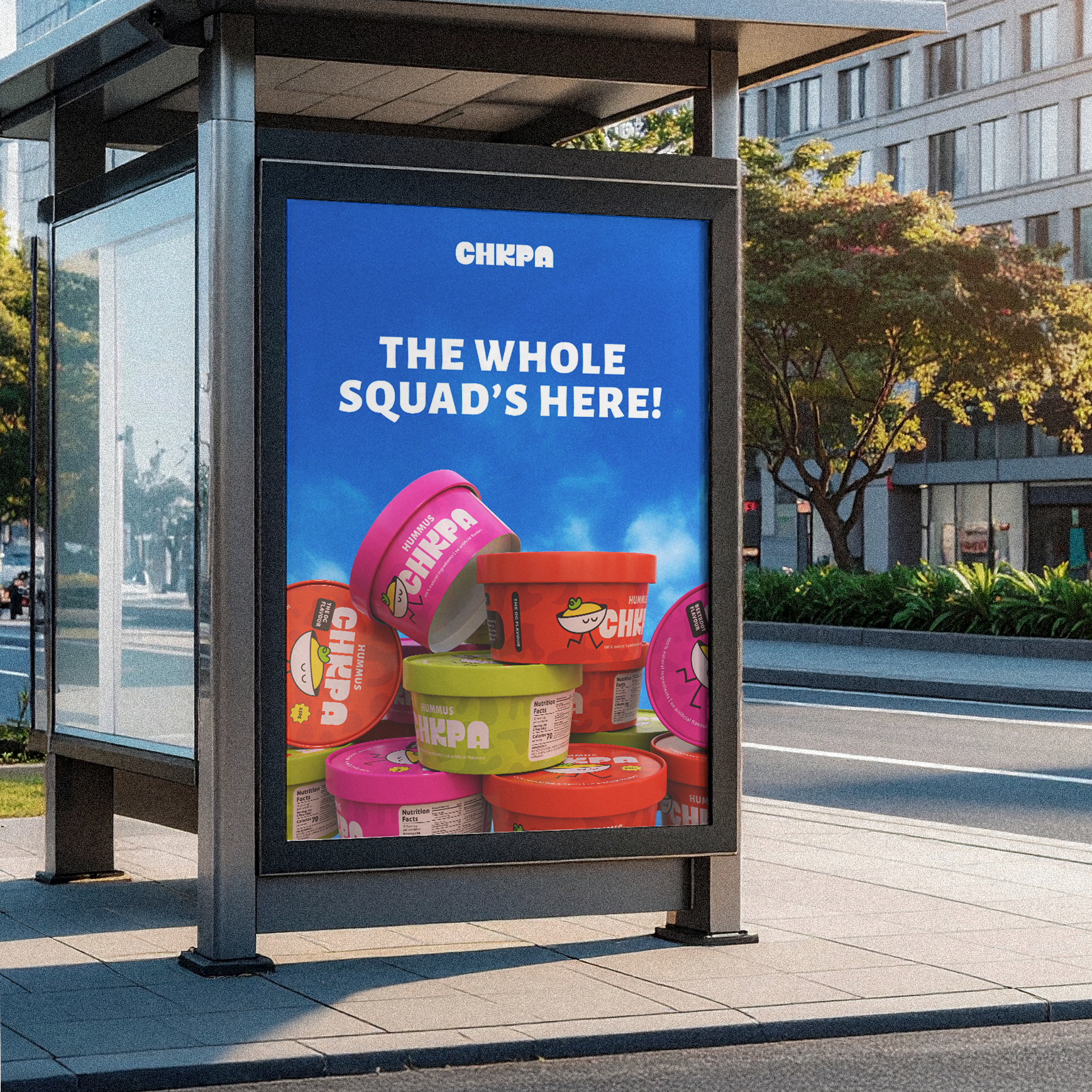
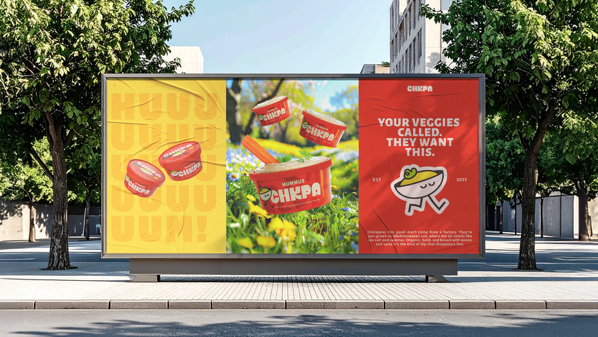
The goal was to create an approachable and energetic visual identity that encouraged consumers to explore all three signature flavours: OG, Beetroot, and Zesty Lime. The packaging and identity system needed to feel playful yet modern, with a bold logo at its core that could stand out on shelf while still inviting curiosity.
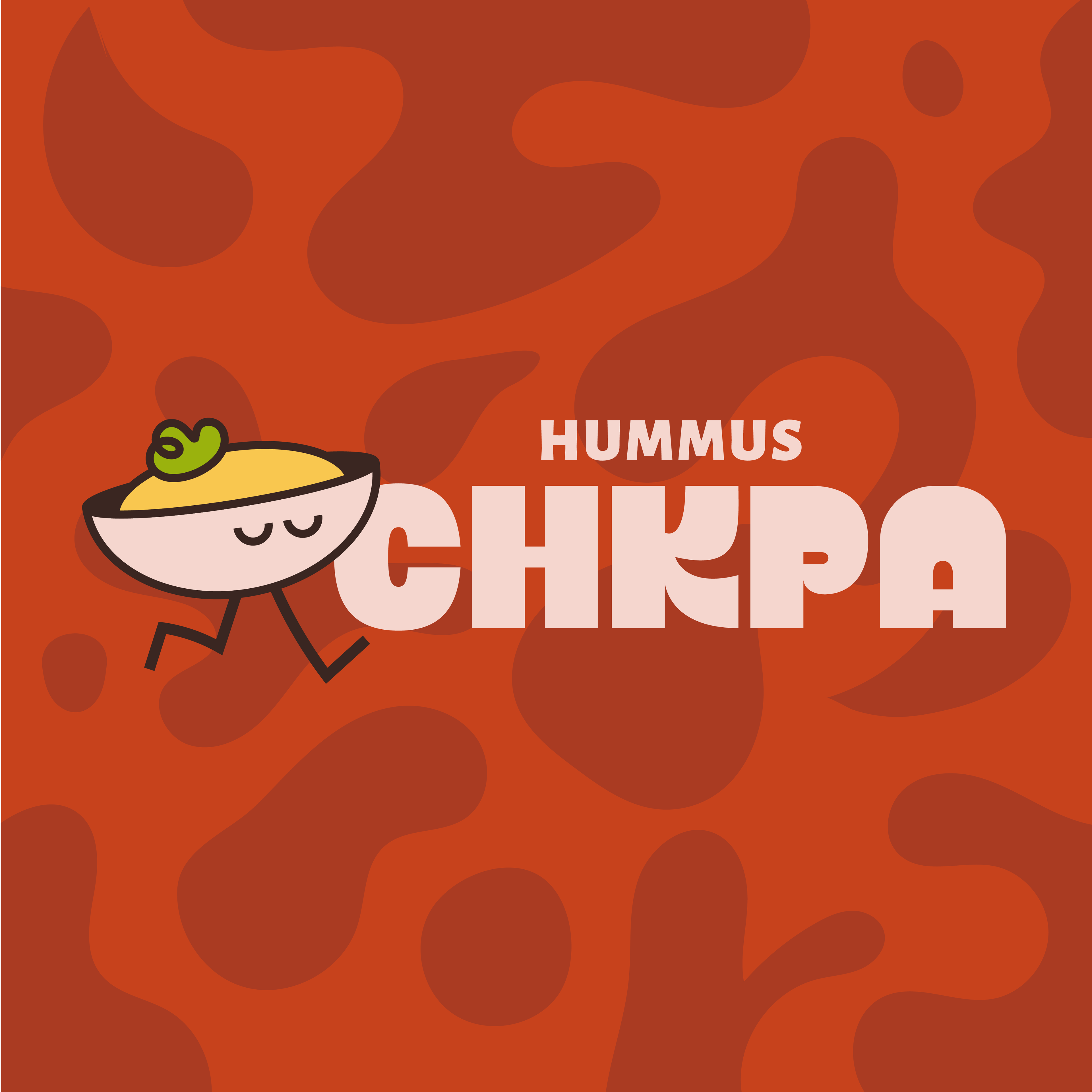
The Logo:
The Chkpa logo was developed using Nitti Grotesk Condensed Ultra as a base reference. Each letter was redrawn to introduce rhythm and a sense of movement, ensuring the wordmark felt dynamic and memorable. Particular focus was placed on the letter K, which was entirely reimagined to serve as the visual anchor and bring cohesion to the full logomark. The result is a logo that feels bold yet friendly, designed to stand out while retaining a sense of familiarity and warmth.

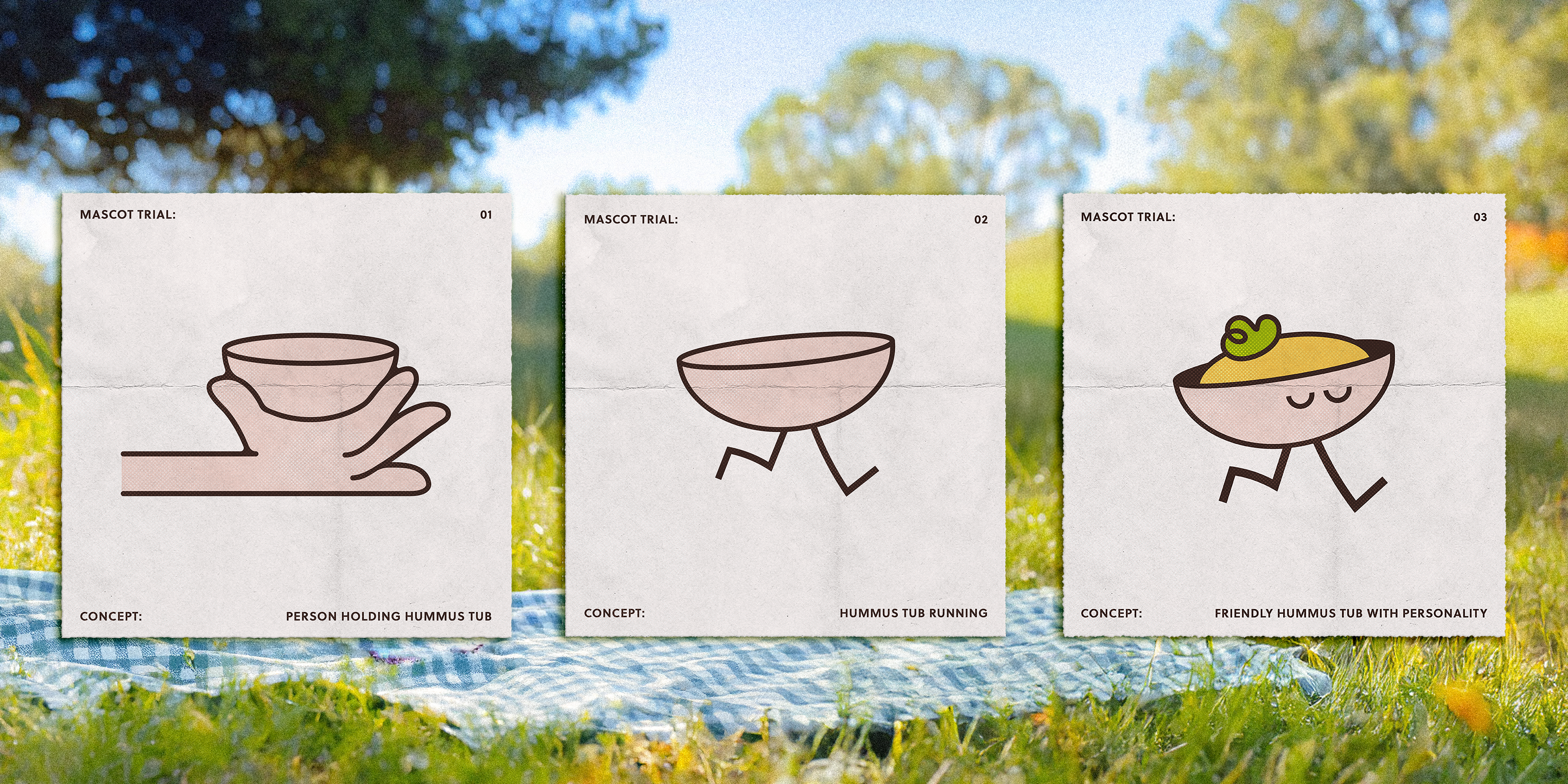
Mascot Development:
A key element in creating a memorable brand is building character, and what better way to do that than by creating a brand mascot. Several iterations were developed during the conceptual phase, with three variations explored in greater depth. The final selected mascot was chosen for its ability to capture the brand’s fun, inviting nature while remaining simple and easily reproducible. The goal was to create a design so accessible that anyone could draw it, adding to the sense of community and playfulness that Chkpa embodies.
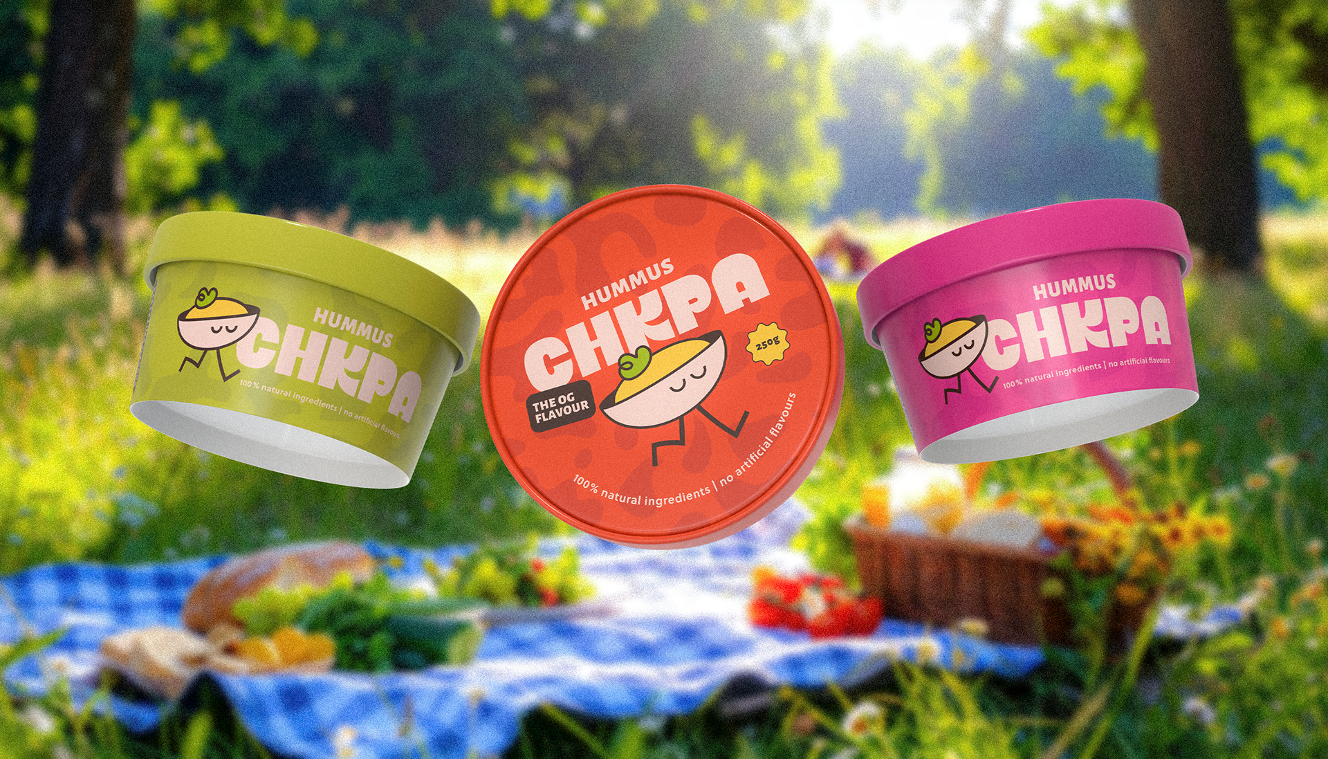
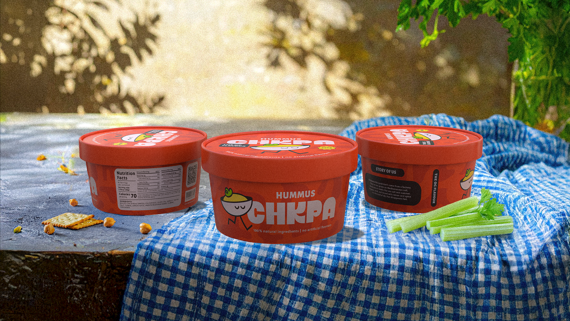
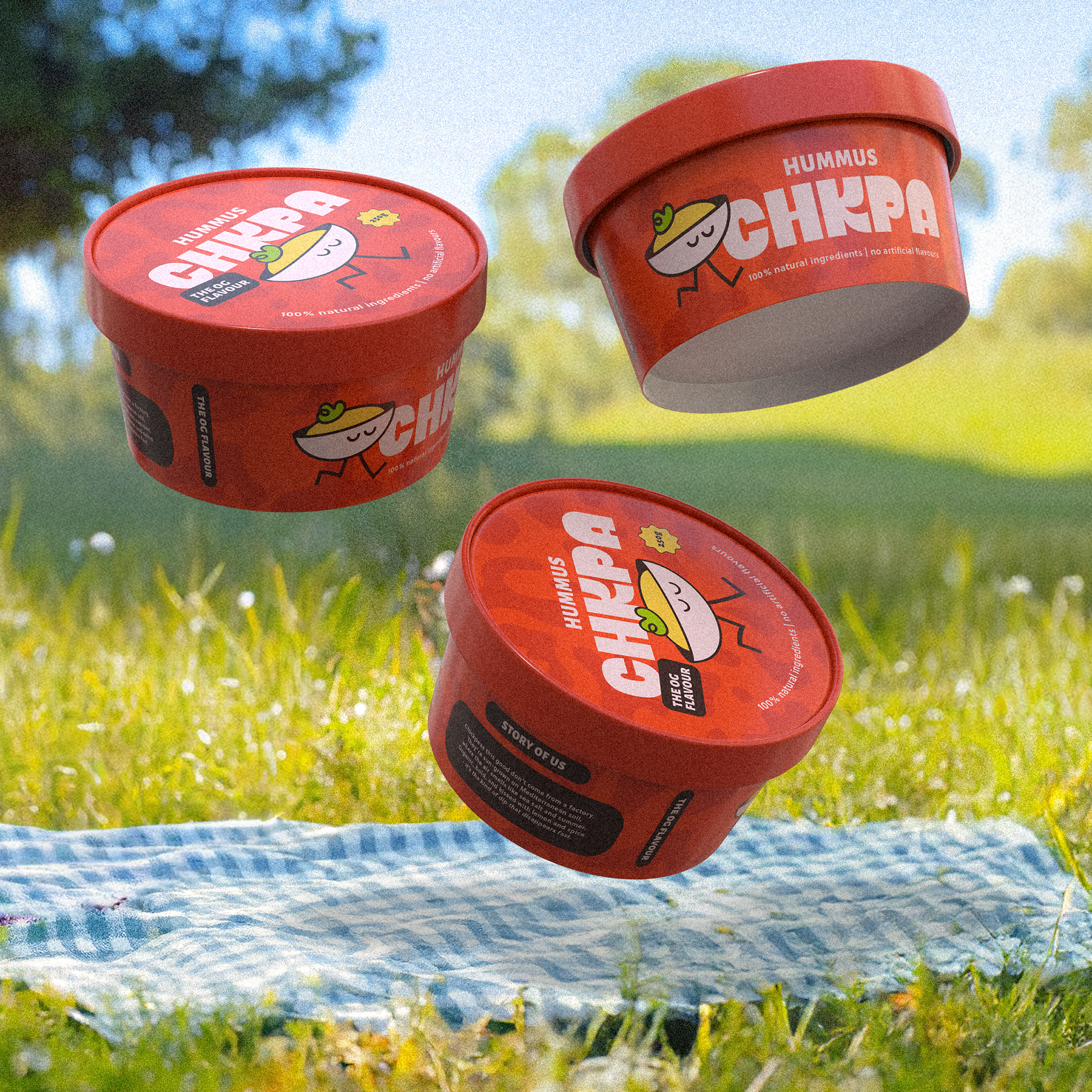
The Packaging:
Packaging played a pivotal role in expressing Chkpa’s brand values. Staying aligned with the overarching theme of friendliness and approachability, the packaging layout was kept minimal yet informative, clearly displaying nutritional facts, the brand story, and digital touchpoints such as the website. A playful abstract wrap-around pattern was introduced to highlight each flavour while allowing the logo and text elements to remain prominent and easily legible. The result is a package that feels modern, vibrant, and approachable.
Print & Promo:
Marketing and promotional assets were designed with simplicity and clarity in mind, particularly for digital platforms like social media where visual clarity is essential. The primary objective was to let the product speak for itself, keeping the focus on the packaging and brand tone while ensuring high visual impact even in fast-scrolling environments.
Behind The Design:
This branding project was such a joy to bring to life. I loved exploring how traditional design techniques, AI-powered tools, and some human imagination could work together to create something fun, bold, and consistent. What excited me most was building a visual language that doesn’t just look good but feels good. Something that invites interaction and leaves a lasting impression.
My next step? I’d love to experiment with motion to bring even more life and personality into my design work. Whether it’s subtle animations or dynamic campaigns, I want the brand story to feel alive and evolving. At the heart of it all, my focus is always to communicate clearly, build meaningful interactions, and ensure every design choice adds real value to both the brand and the people engaging with it.