Run to the Pub
Run to the Pub is an annual running event that takes place every year on the 14th of March. Hosted by Pub 317, the event features both a 10K and a half marathon, all wrapped in a distinctly Irish identity inspired by St. Patrick’s Day, lucky symbols, and the social energy of the pub.
From the beginning, the aim was to move away from the feel of a traditional race and instead design an experience that feels celebratory, welcoming, and memorable. One where competition and community pushes you to the finish line.
Services:
Brand Identity, Strategic Design, Illustration Design, Creative Direction
The Design Approach:
The core focus of this project was inclusivity. With an audience ranging from competitive runners to families and spectators, the branding needed to feel energetic without being intimidating.
Bold typography and a custom brand mascot were introduced to create a playful, approachable tone. The concept of “luck” became a key creative thread, allowing participants to race for time, for fun, or for the chance to win the event raffle, symbolised by the pot of gold.
Beyond promoting Pub 317, the event was designed as a full-day experience, featuring live music, food stalls, games, and social spaces that invite everyone to take part.
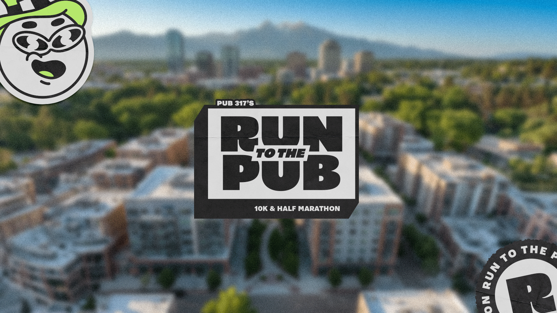
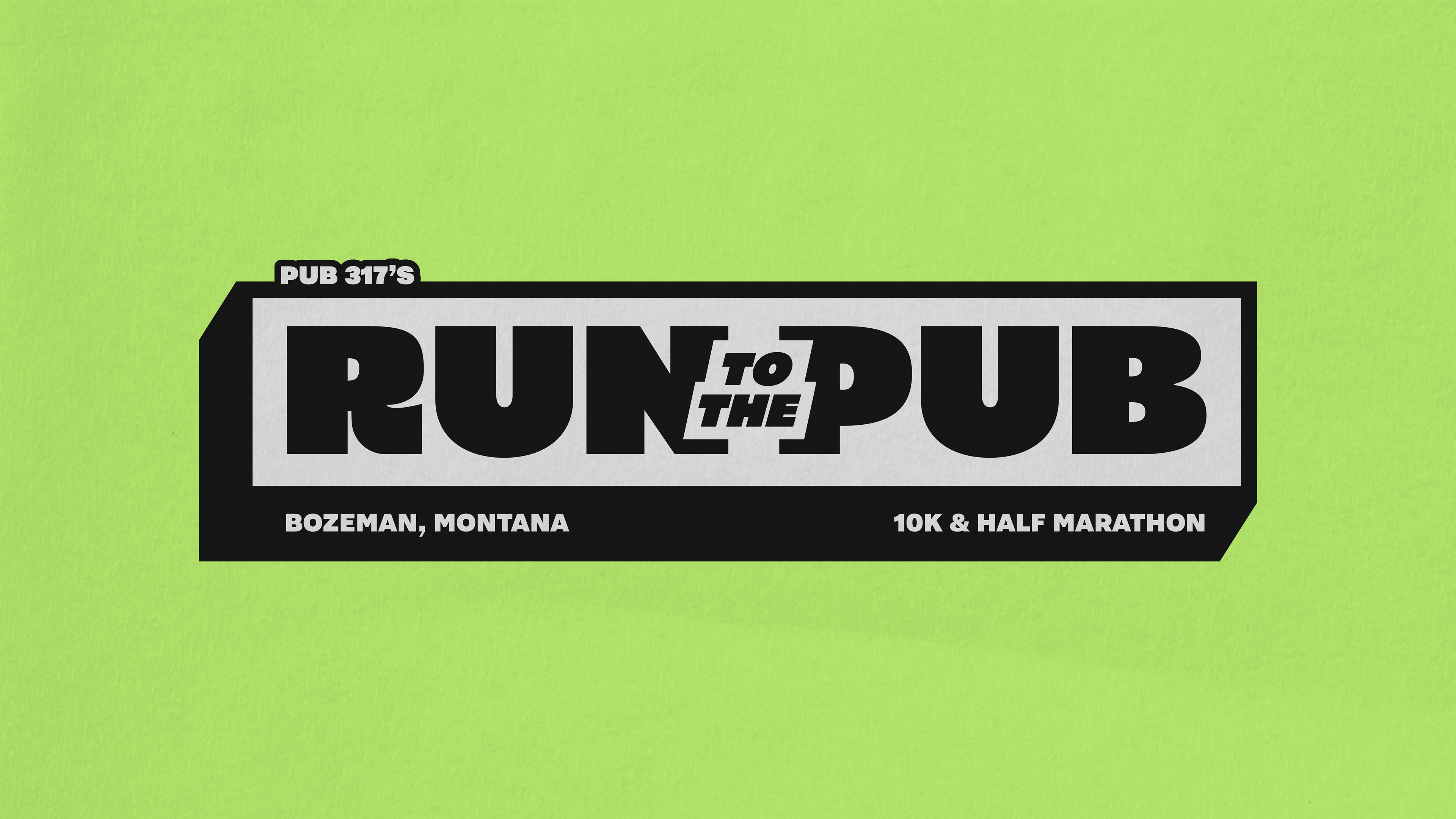
The Logo:
The logo was custom designed to feel bold, energetic, and functional. A strong outer border gives the mark impact while also framing essential event information such as location and race distances.
Bold letterforms ensure clarity across both print and digital applications, balancing a sporty structure with a playful personality.
The Brand Icon | Logo Variations:
Versatility was a key consideration throughout the design process. Multiple logo variations were created to ensure the identity could scale from large-format advertising to smaller pub and merchandise applications.
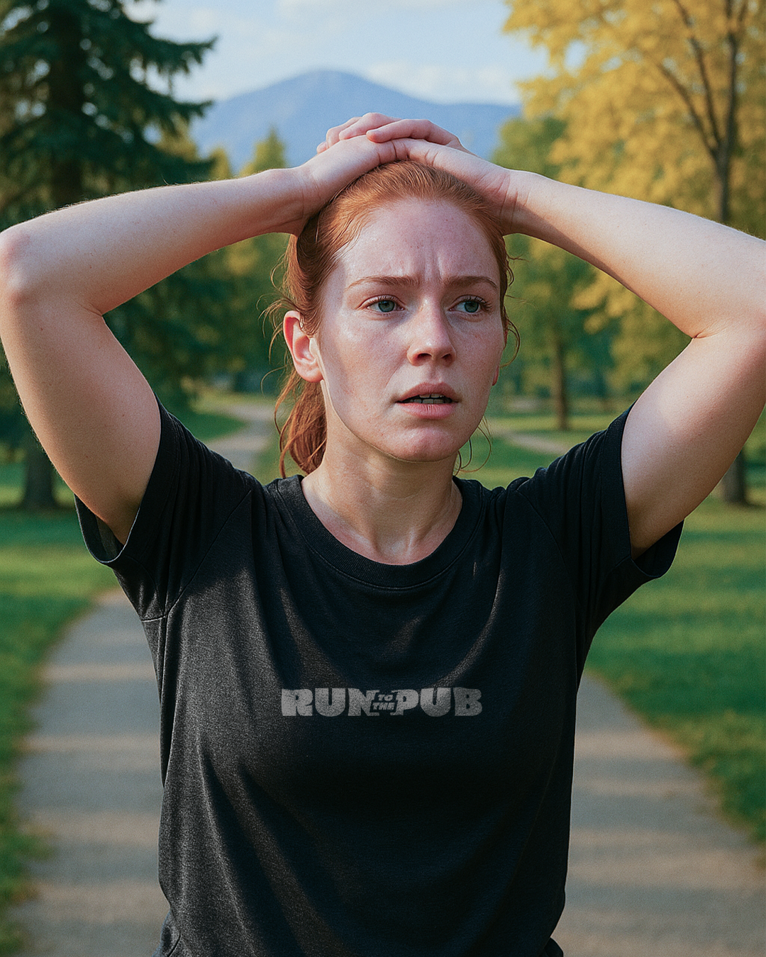
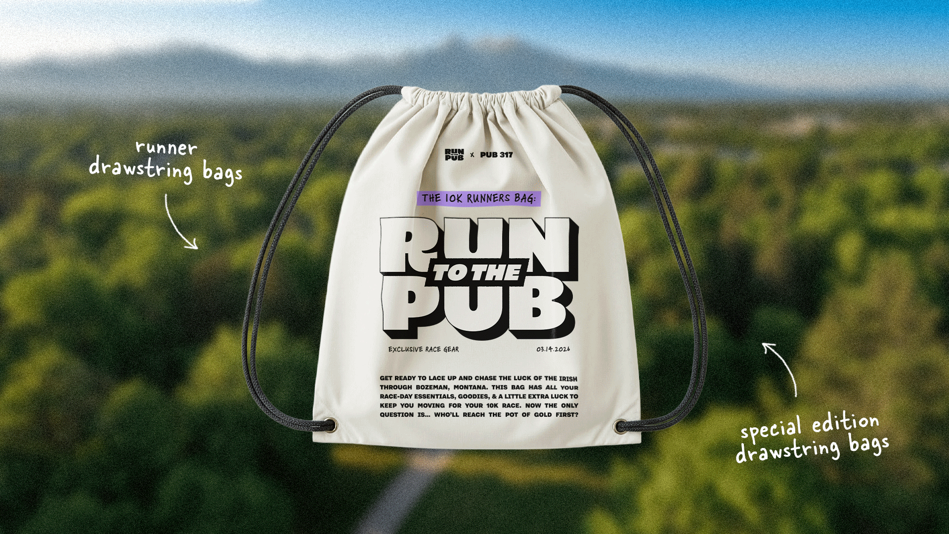
A simplified brand icon was developed for social media, while a borderless version of the logo was designed for items such as t-shirts and drawstring bags, allowing the brand to adapt while staying consistent.
Brand Mascots:
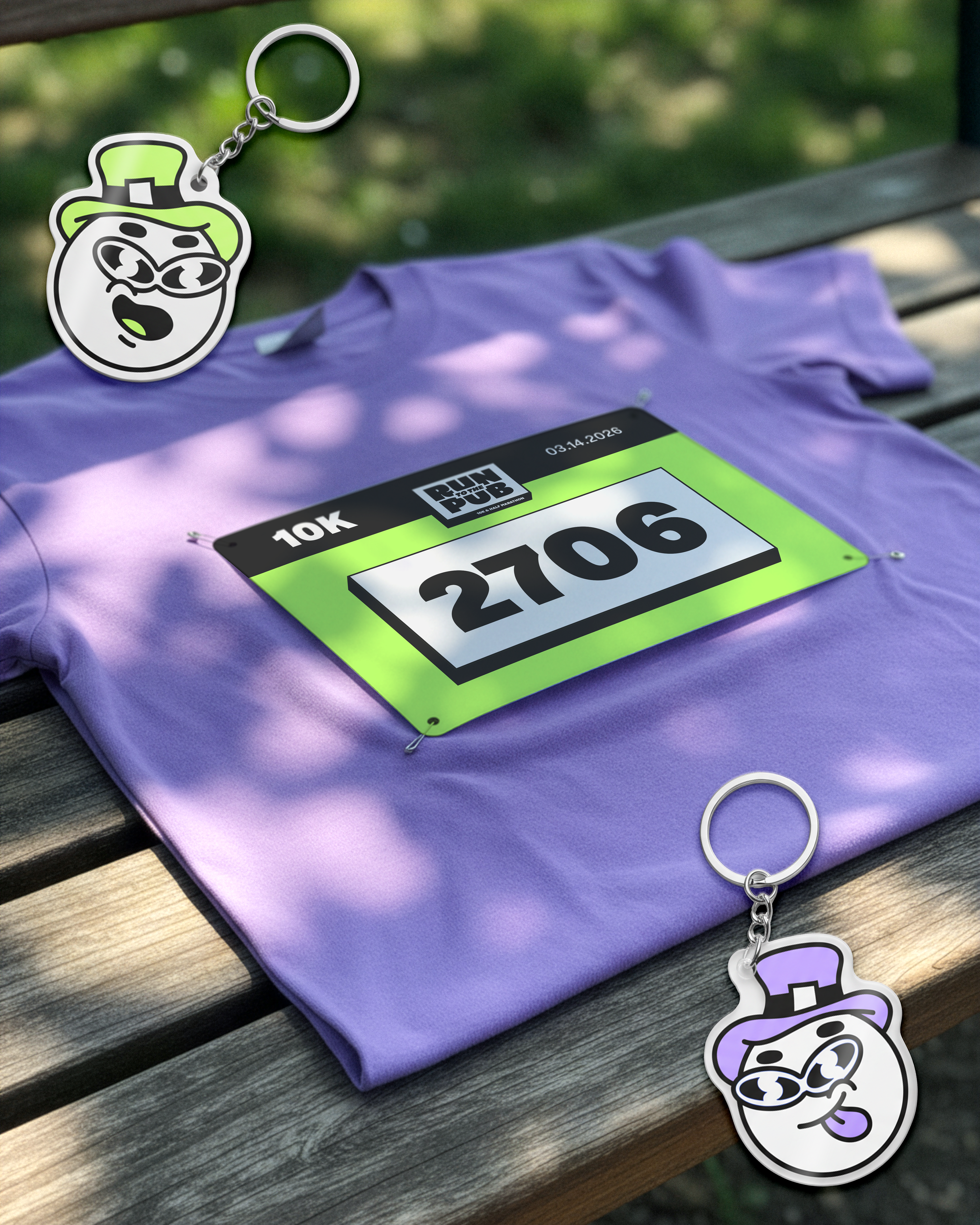
The brand mascot plays a central role in building recognition and personality. Designed with merchandise in mind, it can be applied across stickers, keychains, and promotional items.
Inspired by an Irish leprechaun, the mascot acts as a guide for event-goers, leading them toward the pot of gold. The pot of gold represents the event raffle, turning a simple prize into a playful narrative element within the brand.
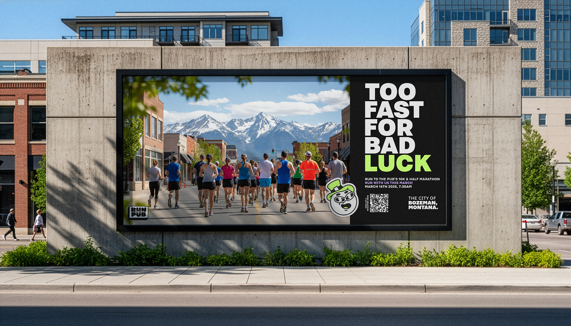
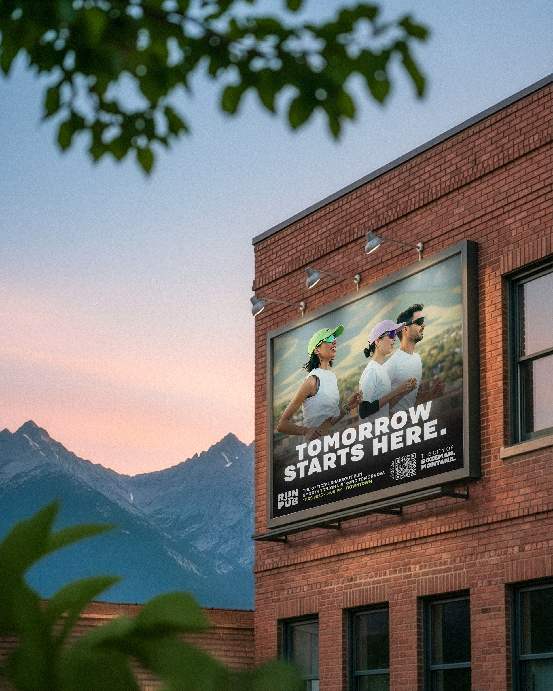
Print & Promo
These materials were treated as the first point of contact with the event. These assets communicate what Run to the Pub is, how to join, and what makes it stand out.
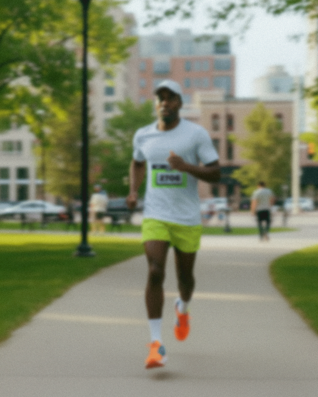
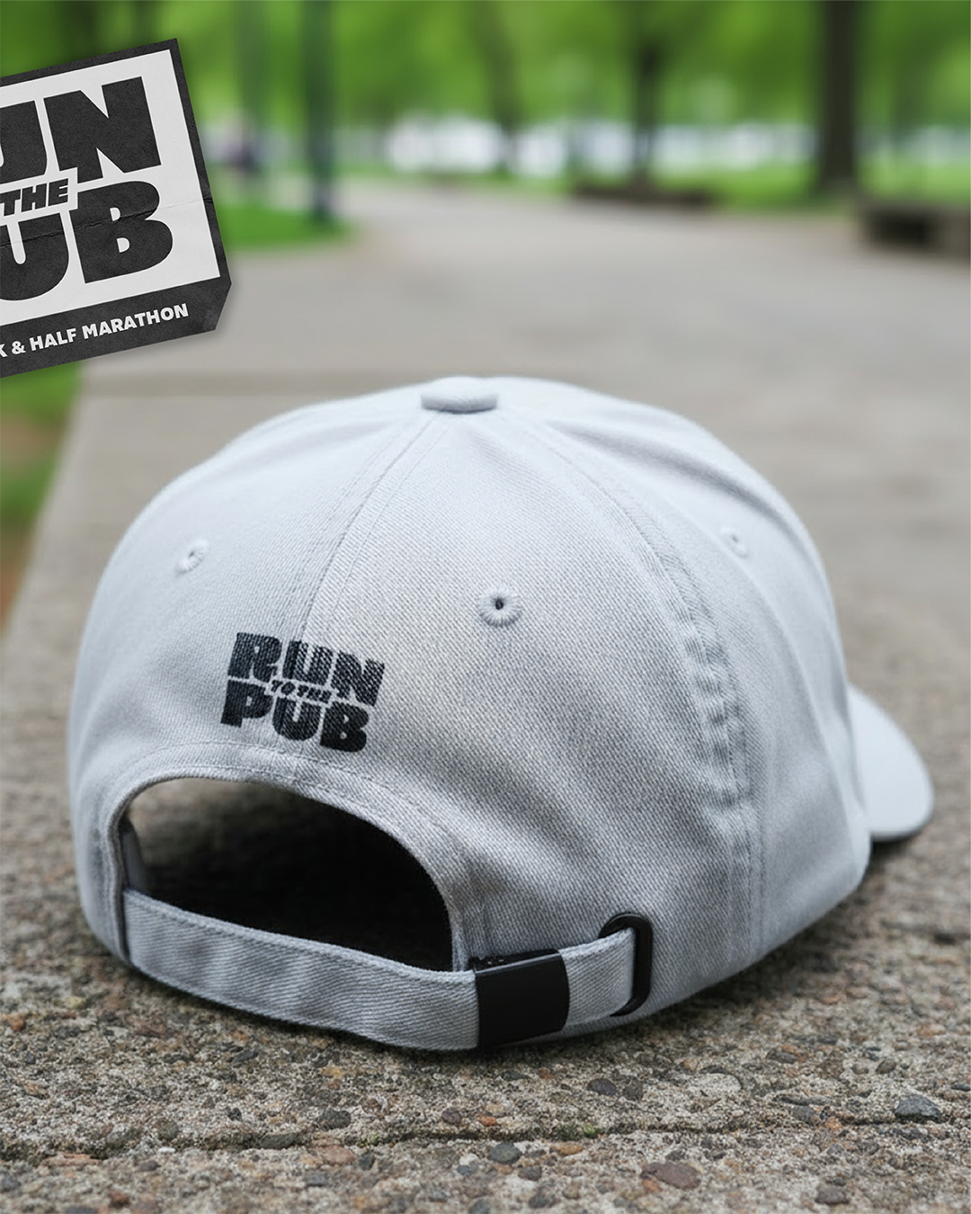
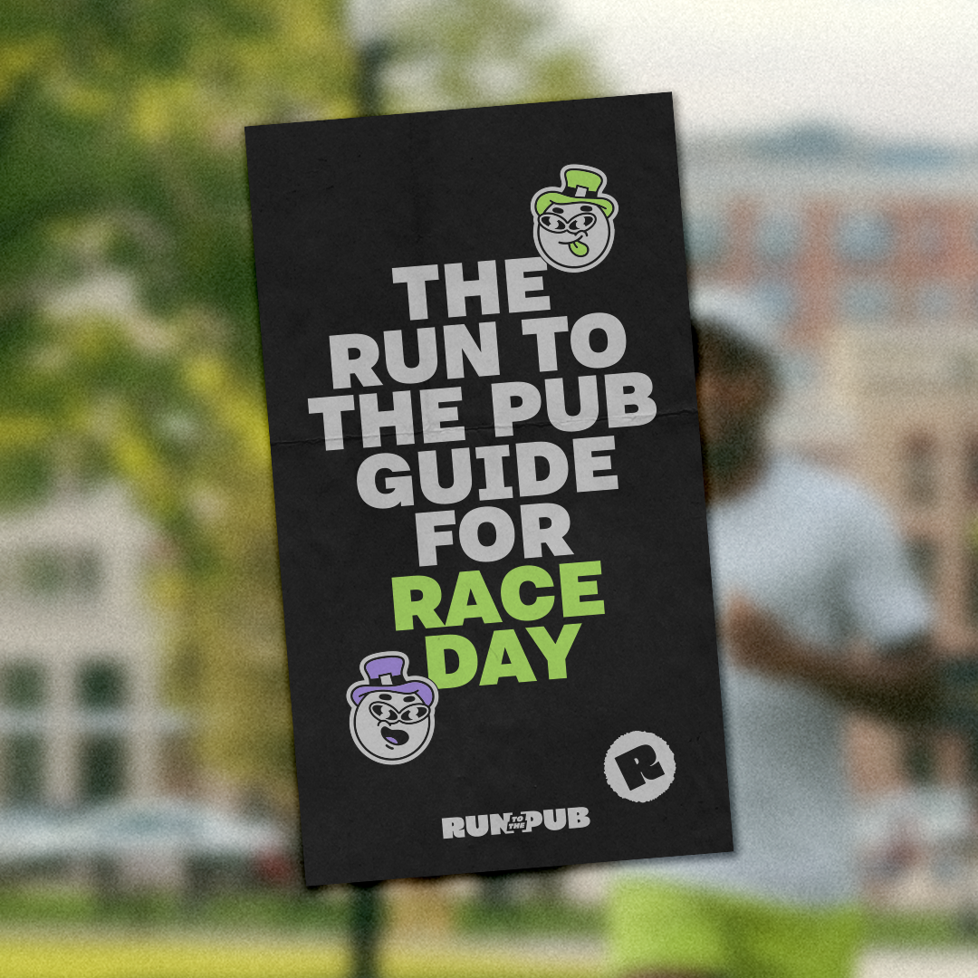
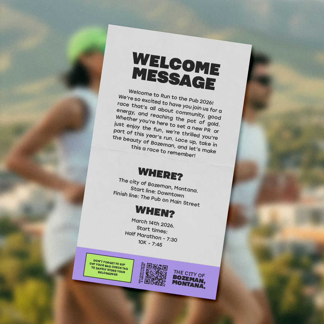
The project includes city billboards and a merchandise kit placed inside each runner’s drawstring bag. This kit features a drawstring bag, running bib, t-shirt, baseball cap, stickers, and a keychain. A brochure was also designed to guide participants through the day’s schedule and activities.
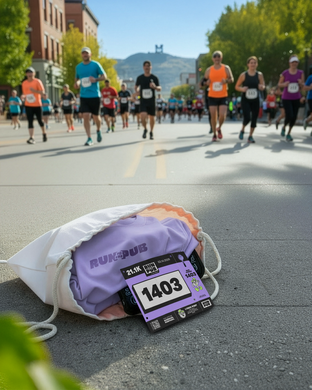
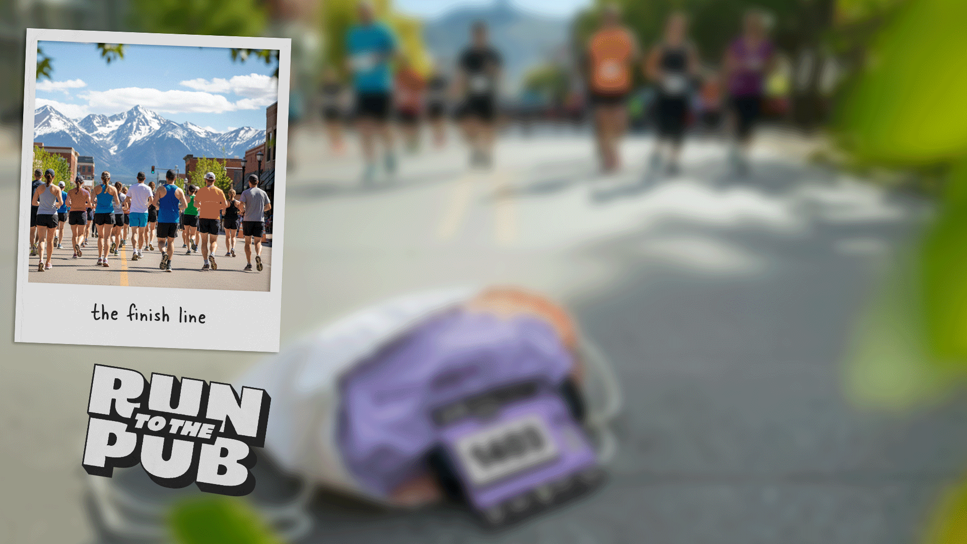
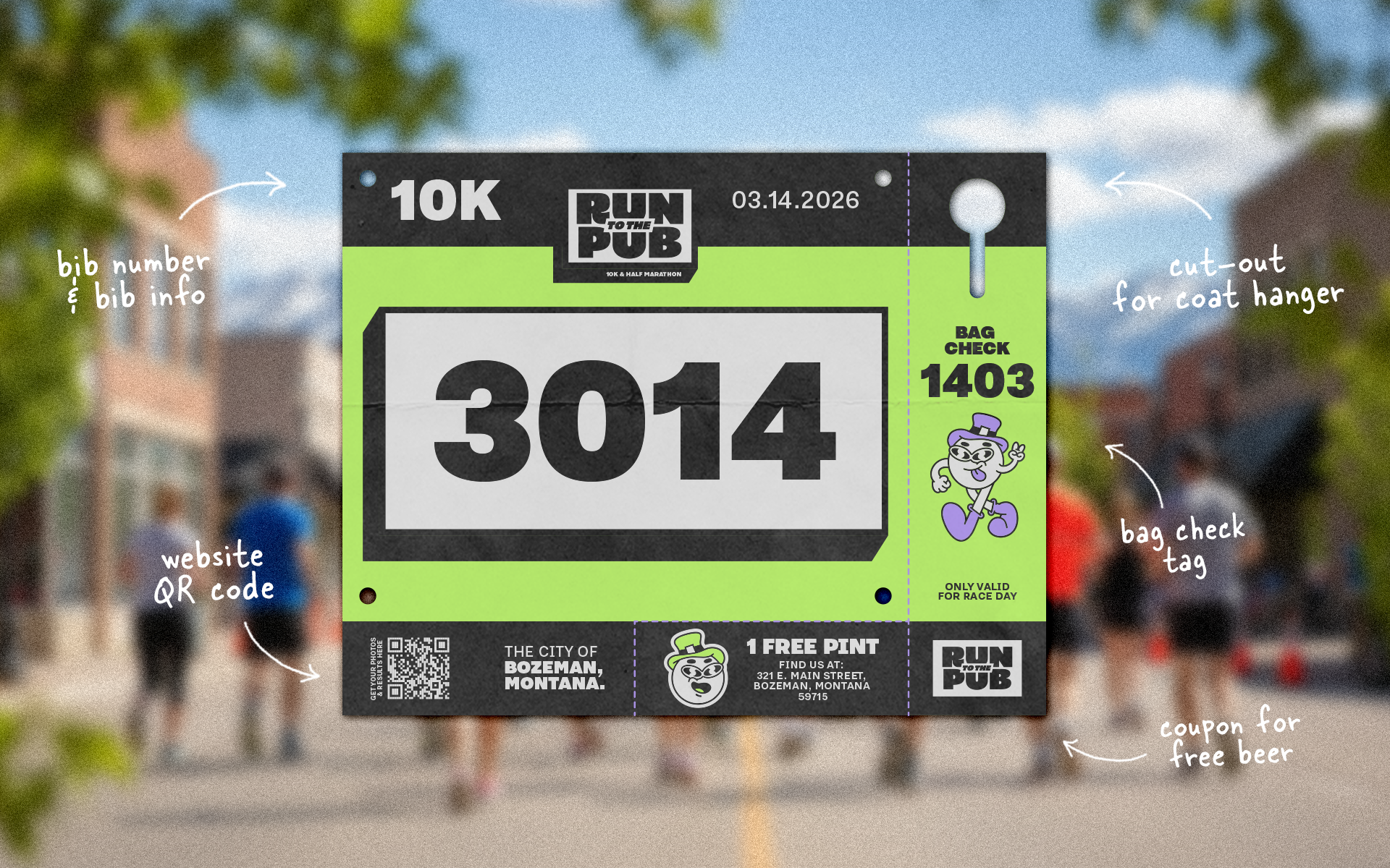
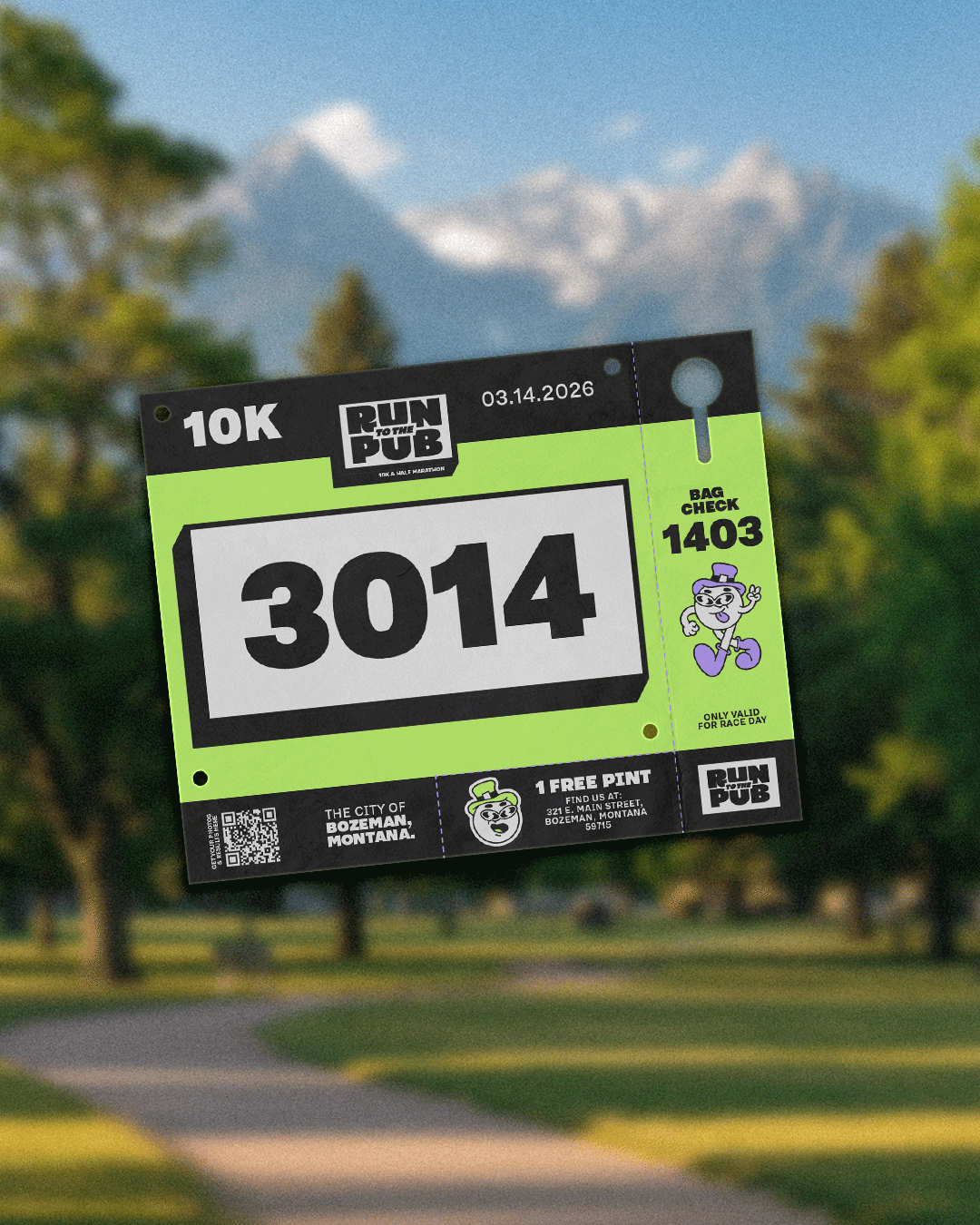
Runner's Bib Design
The runner’s bib was designed to balance clarity and functionality. The layout includes tear-off tabs such as a free pint coupon and a bag check tag for secure storage during the race.
To support event organisation, bibs were colour-coded: green for the 10K race and purple for the half marathon. This system helps runners navigate the event while allowing staff to manage crowds more efficiently.
The designer's notes:
Event branding requires more than strong visuals. Organisation, clarity, and ease of use are just as critical to the overall experience. For larger events, branding needs to work as a clear system, one that can be applied easily across multiple touchpoints and understood by both participants and event staff.
When a brand is structured and intuitive, it becomes the backbone of the event, guiding everything else visually and operationally. This allows organisers to focus less on logistics and decisions, and more on delivering an experience that truly matters. Good design should reduce stress, not add to it.
This was the first event brand I’ve worked on, and it was a privilege to navigate the challenges that came with it. Through creativity, problem-solving and research, I aimed to deliver more than a good-looking identity, building a strong foundation with clear structure, flexibility, and confidence in how the brand shows up in the world.
Might sound crazy but... Run to the Pub, you are my Roman Empire. Hopefully one day I can run with you :)